We added two new Bitcoin charts this week.
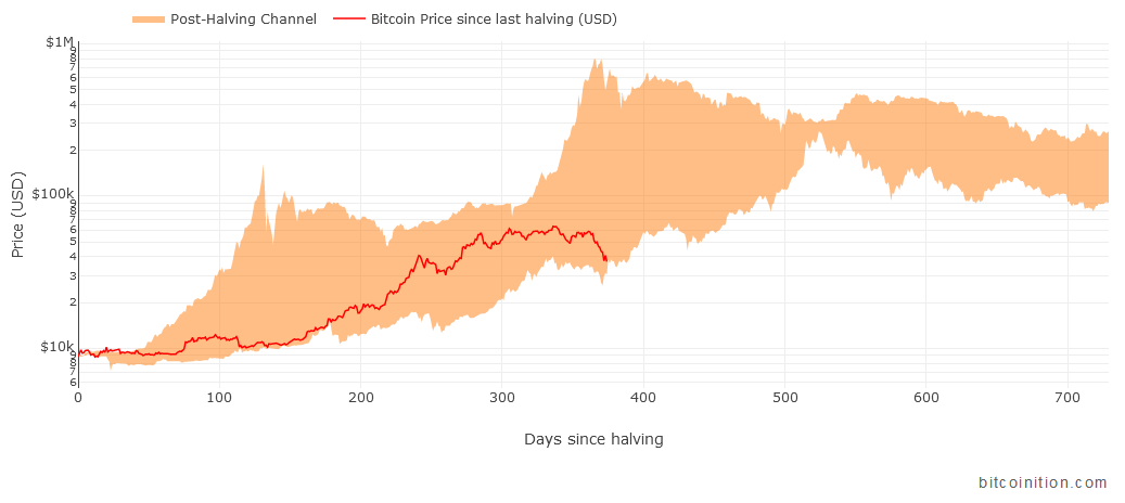
The first is the Post-Halving Channel. It shows the range of Bitcoin price after each halving. The chart includes two cycles for now : post-2012 halving and post-2016 halving. Until now, the price of this current cycle has stayed in the channel but it is now reaching the bottom edge.

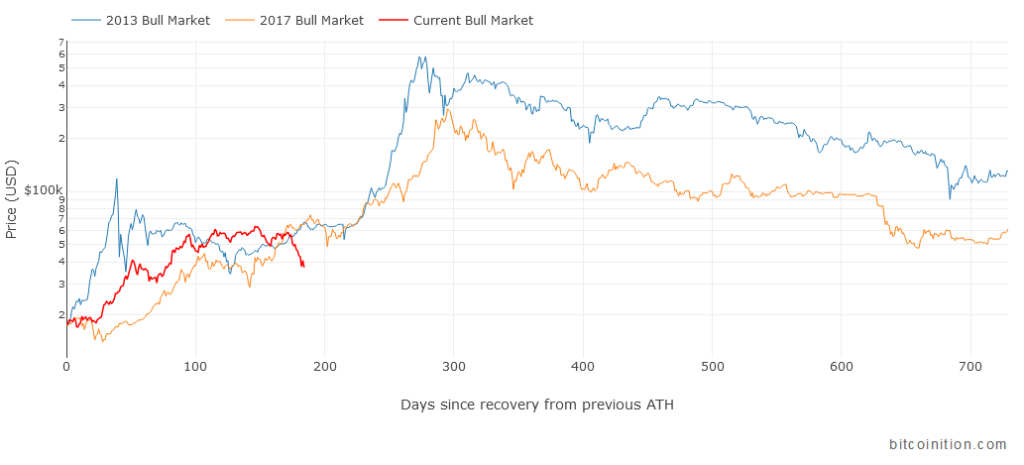
The second chart is the Bull Market Comparison. The concept is similar but each cycle starts after the price recovers 100% from the previous all-time high. It marks the beginning of a new bull market. Until now, the current cycle has been similar to the previous ones.

Both charts are similar because in previous cycles, halvings have been correlated to an increase in price. This may not be the case in the future because the market is now much more driven by demand and less by the decrease in supply post-halving.
They also show that the current drop, although severe in absolute value, is not unusual. There has been a sharp drop in 2013 shortly after the 2012 halving, followed by months of sideways action. In 2017, there was also several drops before the final push to $20k. In addition, the MVRV Z-Score indicates that we may have to wait to reach the top of this cycle.
It will be interesting to see how the current cycle compares with the past thanks to these two new Bitcoin charts. If history repeats itself, the top may be 100 to 200 days away.
